CLASS:
ART 1230: TYPOGRAPHY AND LAYOUT
PROFESSOR:
VIRAG WHITE
SEMESTER:
SPRING 2025
ART 1230: Typography and Layout
Postcard Design
Front of the postcard
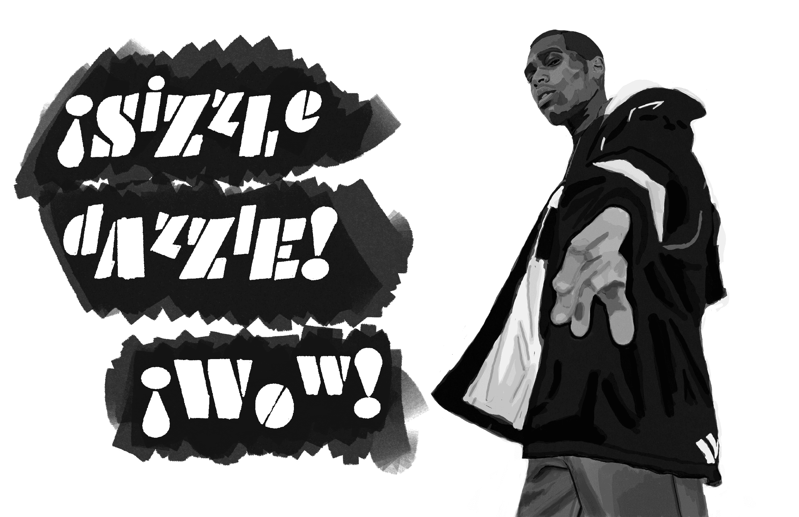
Include the following headline type: Sizzle! Dazzle! Wow!
Create and use a photo marker indication
Back of the postcard
Headline: _______________ International Fashion Show at Stromfeld
Body text:
(First place three lines of fake body text.)
Saturday, ________________ at 3:00 PM.
(Then place 7 lines of fake body text.)
Informational Text
Return Address
Include the supplied logo
For this project I was pretty excited to make the marker indication because I'd recently gotten some great Procreate marker brushes and knew it would be a lot of fun. From the beginning I knew I wanted to make something a little less "high fashion" and more casual. I started by finding a number of photos on Unsplash and spent a lot of time sketching them, and then moved on to some solid thumbnails once I got an idea of the shapes I was going to be working with. I also spent a ton of time deciding on fonts, which is very typical of me because I'm a big type geek.
I am ridiculously picky and a huge perfectionist when it comes to a lot of design things, and I don't think I was able to perfect this in the way I wanted to, so I would change a lot about the process if given the chance. That being said, I do think I benefited from working with these particular measurements, which I had never done before, and I still had a lot of fun.

Final Project: Newsletter
Required Layout Elements
Design a front-page masthead with the current semester/year
Write three major story headlines
Write three subheads under at least one of your stories
Filler text may be used for the body text but not the headlines and subheads
Write and include at least one each of the following layout elements: byline, photo credit, jump line, caption
Write and include headers and/or footers on at least one of the inside spread
Use page numbers on the inside spread
Create a mailer with an address and postage area on the lower half of the back page
Required Visual Elements
Marker comp or digitally create at least one original illustration.
Any illustrations used must be original. Do not copy someone else's existing illustration.
Create an illustration according to your skill level. Use a chart, diagram, or hand-written typography if unsure about your drawing skills.
In addition to the illustration(s), marker comp includes at least one “stock” photo. Any other photos used are optional but must be original.
All visual elements must be converted into one of the project spot colors. (Watch the video tutorial on how to convert scanned art and photos into one-color spot color.)